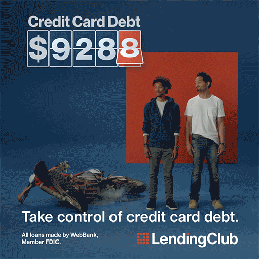
Fully integrated campaign for LendingClub spanning DOOH, broadcast, social ads, display ads, and direct mail. The campaign goal was to create brand awareness and interest in various target markets across the nation.
With the goal of increasing brand awareness the visual direction leaned heavily on simple but impactful messaging of our most valuable offerings. The graphics focused mainly on our primary brand colors and our bold square visual motif.
Workplace graphics for a newly built LendingClub office in Lehi, Utah. Expansion of the brand into office spaces, lobby, and common areas. Highlighting our brand promise, company values, and customer stories on a larger scale.
Working with the architecture and workplace services teams I was able to develop various spaces where we wanted to lean heavily into our brand such as the lobby. In the lobby waiting area I wanted a place to share our customer stories. Using our square motif with a warm wood material we brought these customer stories to light. This really aligned with our brand principles of bringing financial wellbeing to our customers.
The other meeting rooms and spaces felt like a great place to use a branded pattern in a bold way in both full color and line work.
Kenwood Vineyard lies in the heart of the Sonoma Valley. The very place that Jack London made his home on the rugged and fertile land. This visual identity is based on the idea that “All Roads Lead to Kenwood” through the illustrated wolf icon. The wolf icon is created with a woodblock style to incorporate the essense of craftsmanship and attention to detail.
Completed at Landor under Design Director, Anastasia Laksmi
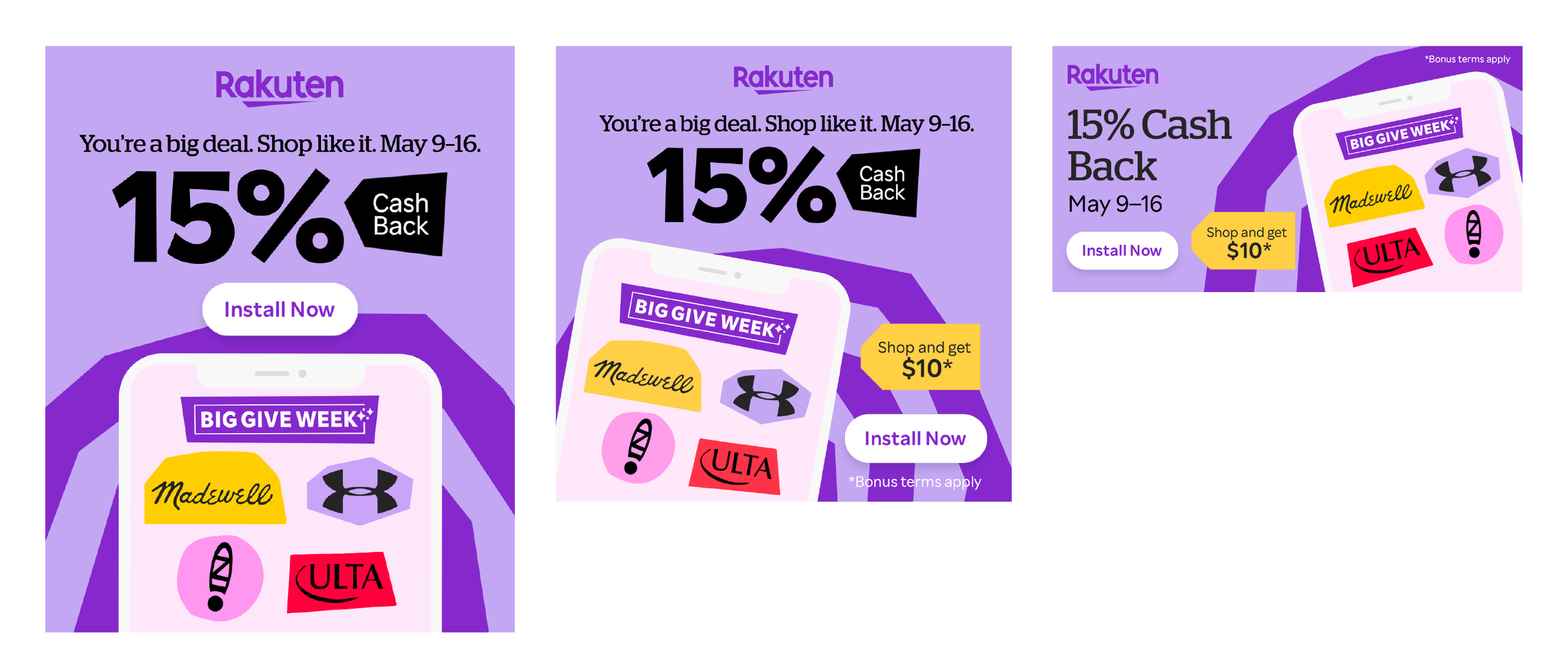
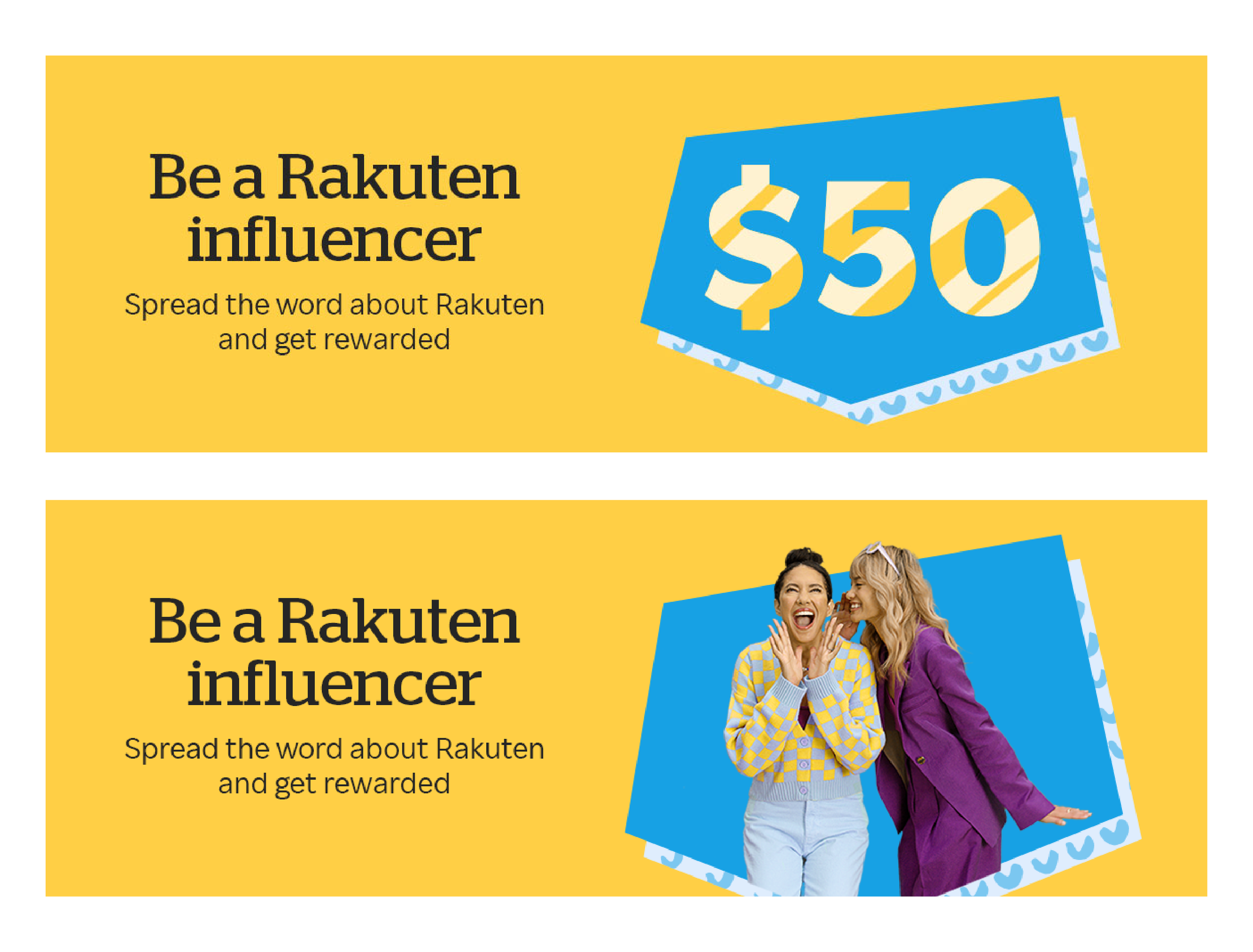
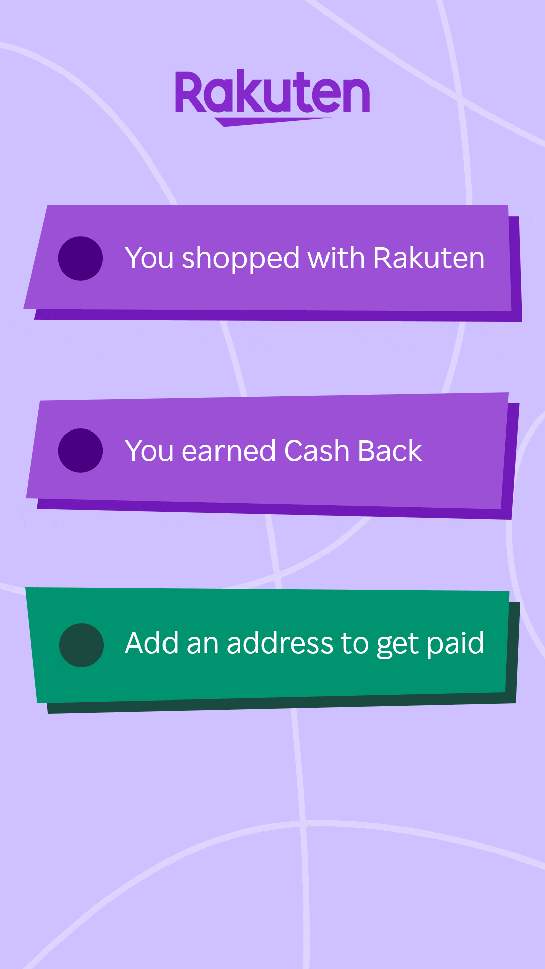
Rakuten’s Big Give Week is a once yearly shopping event where the platform offers up to 15% cash back and other rewards on some products and brands. Think Amazon prime day but for Rakuten. It is one of their most important weeks and the social and digital ad campaign needs to come in strong.
This Big Give Week boasted their signature colorful and exciting brand visuals. There were multiple ad concepts as you can see that leveraged lively product photography, shopping category illustrations, and brand logos. All while highlighting the 15% off offering to entice shoppers.
These social and digital ads were then extended out into various sizes and styles.
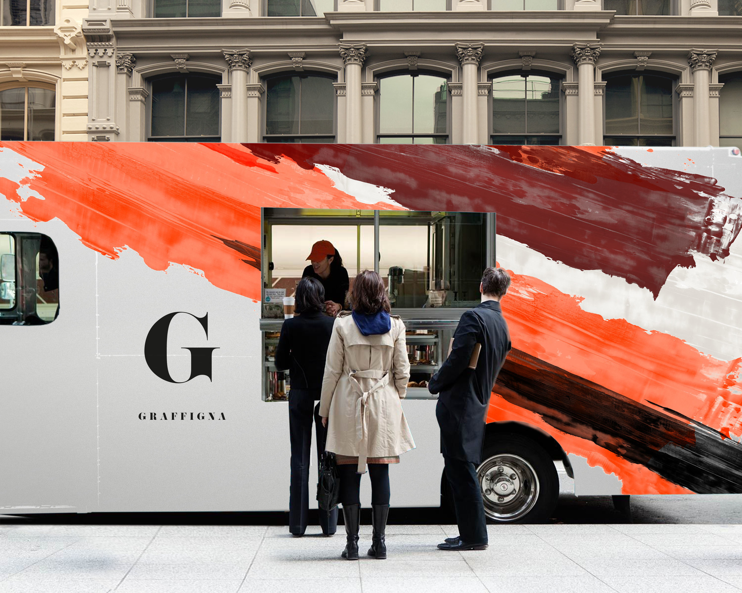
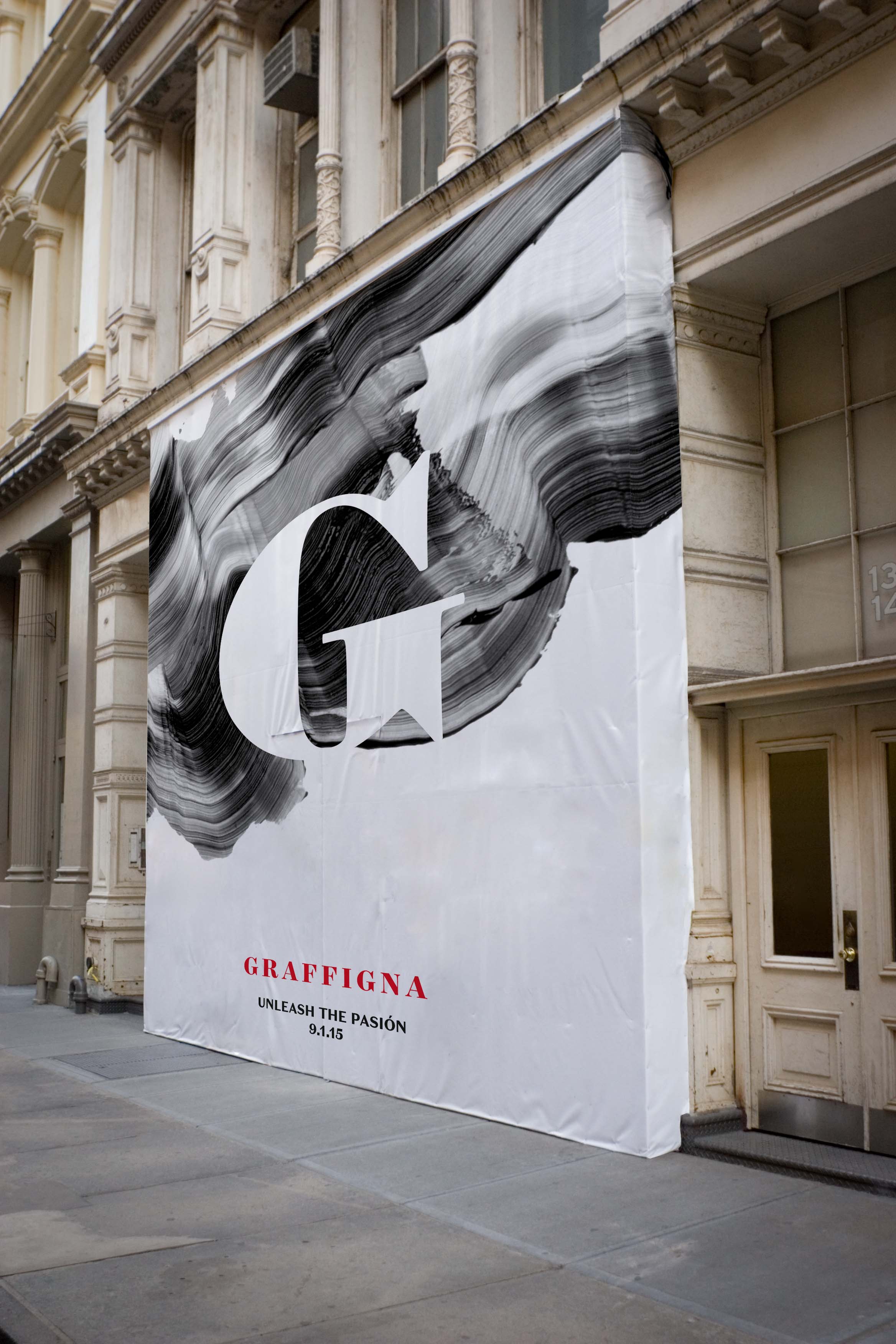
Graffigna is a premium wine company based out of Argentina. Founded in 1870 by an Italian immigrant named Satiago Graffigna, the company is looking to revitalize their wine brand. The brand should express passion and tie to the vibrant culture of Argentina.
The first design concept is a direct nod to the natural mountain landscape of the Andes in Argentina where the wine grapes grow. These colorful stripes of paint are an abstraction of the layers of land and various altitudes that the grapes grow on. The bold paint reflects their vibrant passion. The "G" from Graffigna is highlighted as a strong signal of the brand.
The second design concept plays with contrast to create dramatic tension. The use of paint here creates a fluid, passionate canvas to showcase the "G" of Graffigna. The heaviness of the paint is balanced with a clean and simple solution for the rest of the information on the label.
Completed at Landor Associates. Design Director: Anastasia Laksmi
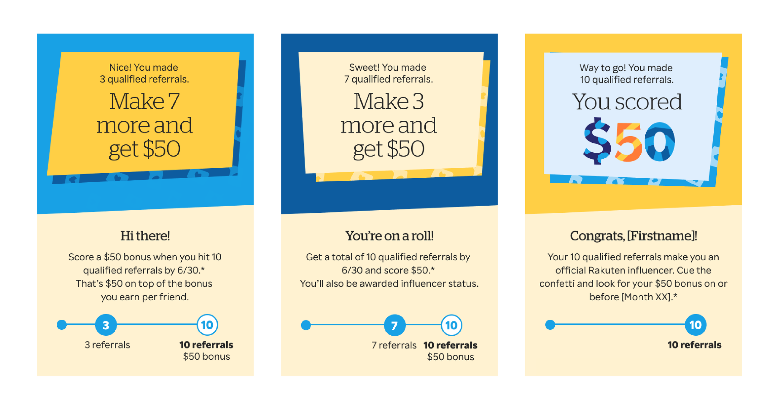
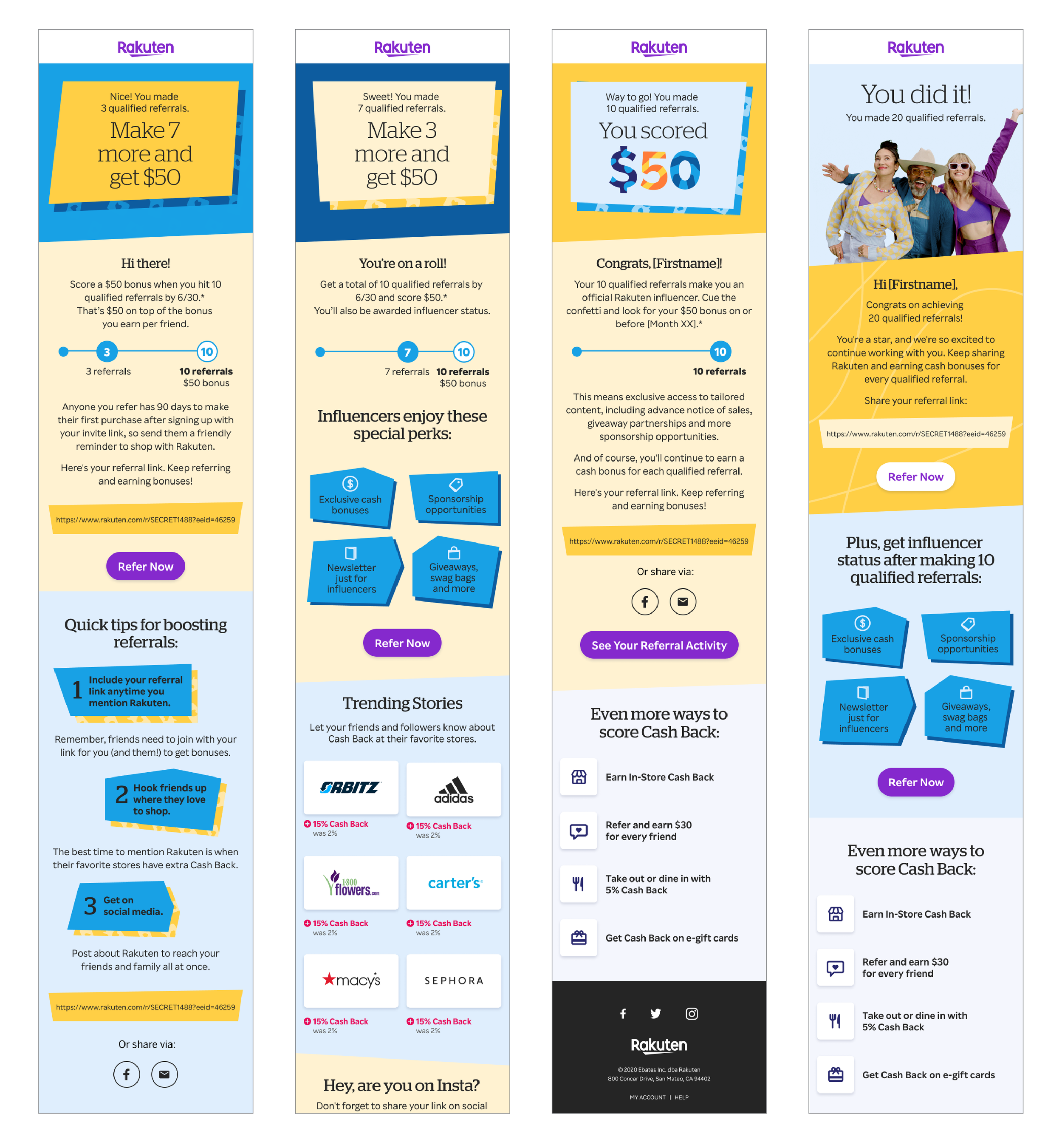
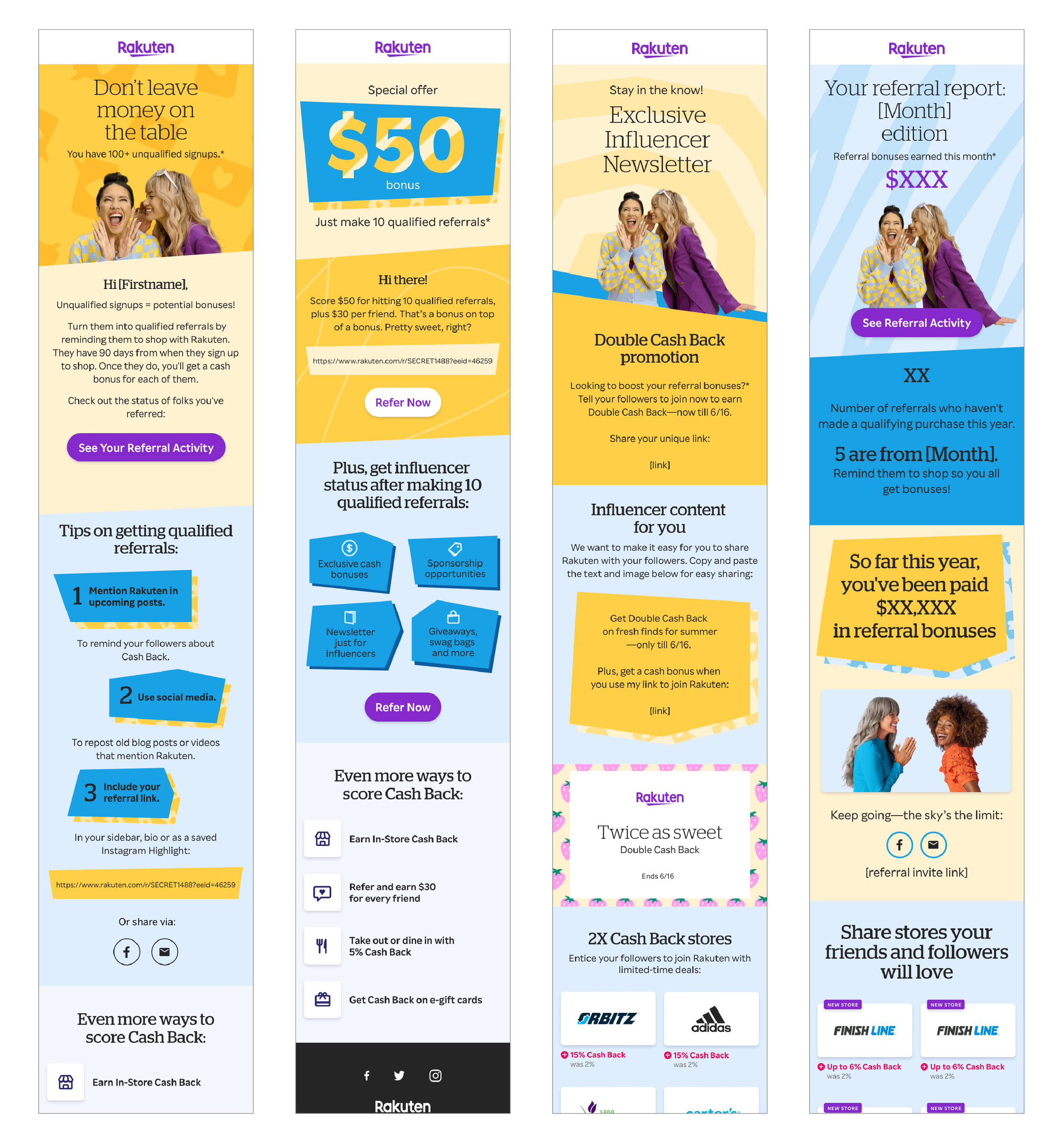
Work completed at Rakuten Rewards for the Refer a Friend (RAF) sector which included a launch to push the incentives of current members referring friends to Rakuten.
The email launch consists of a set of emails that first introduce the members to the RAF incentive with a launch email, then follow-up emails for 3, 7, 10, 20, and 100 referrals made.
In addition to the incentive launch emails, various desktop and mobile headers were created. A refresh of the evergreen RAF emails were also created to bring new life to them and hope to push the incentives for referring friends to the shopping program.
Join the Club is an externally facing recruiting campaign and initiative with the goal of enticing new talent to join our company. With opening new offices in various locations we needed a constistant look and feel for our recruiters to lean on across all channels including social media, Linkedin/Glassdoor, trade shows, and college career events. The bold colored look and feel leaned towards a youthful market of recent college grads. Swag such as t-shirts, frisbees, sunglasses, recruiting business cards were developed.
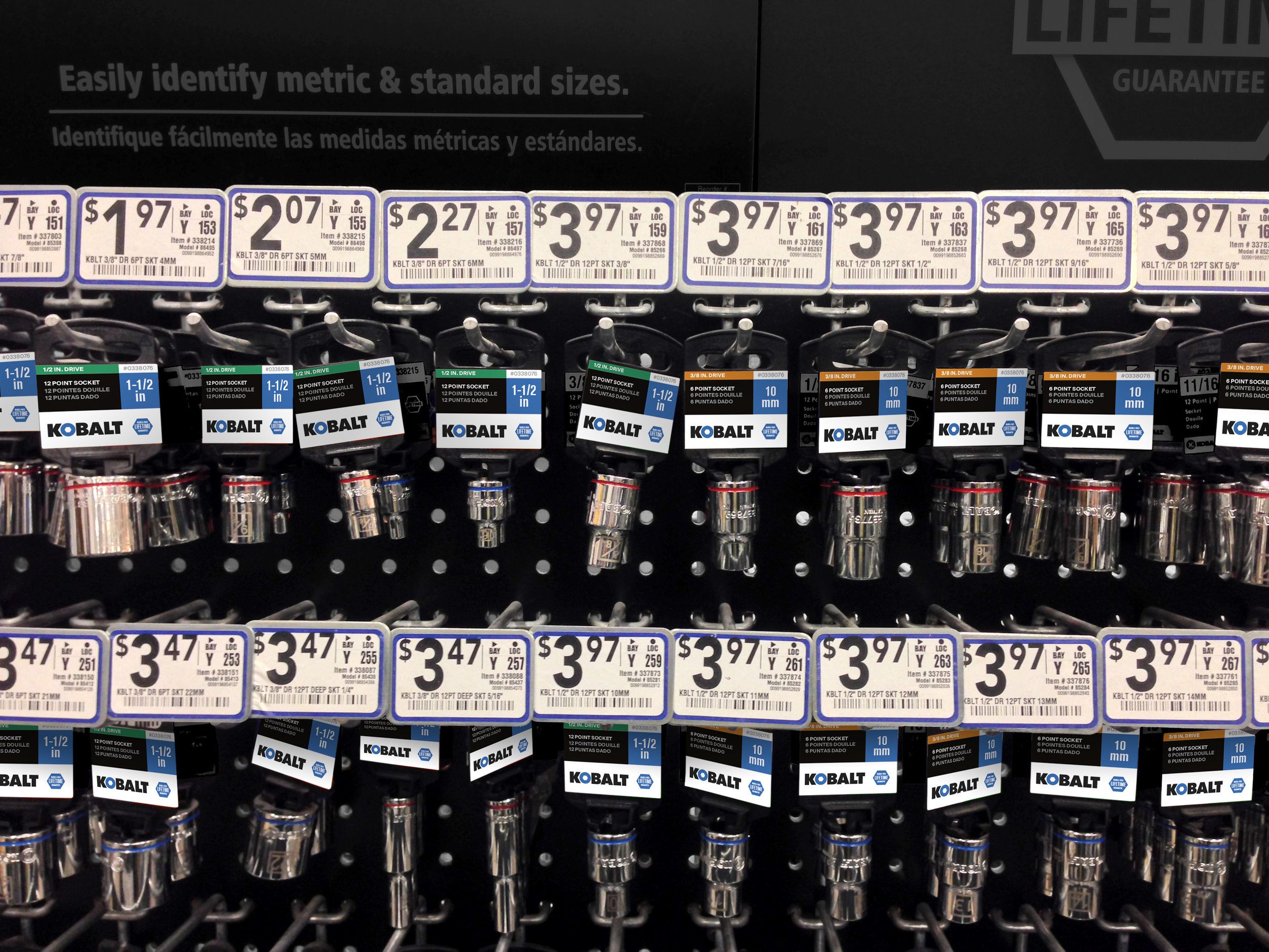
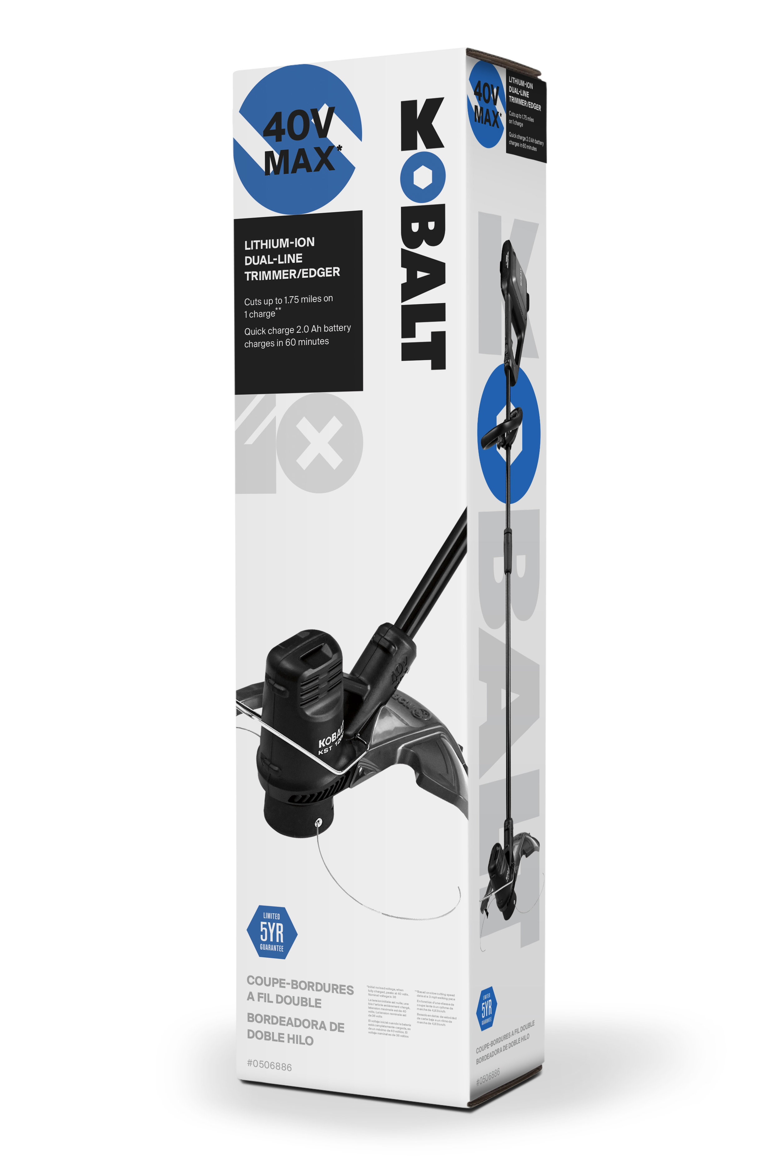
Proposed look and feel system for Lowes Kobalt Tools. The tool system wanted to be bold and appeal to the serious or professional craftsman.
This system spanned a variety of their tool packaging and various in-store displays. By using this simple tool shape language the system could be felxible but also felt bold and simple to use.
Completed at: Landor Associates
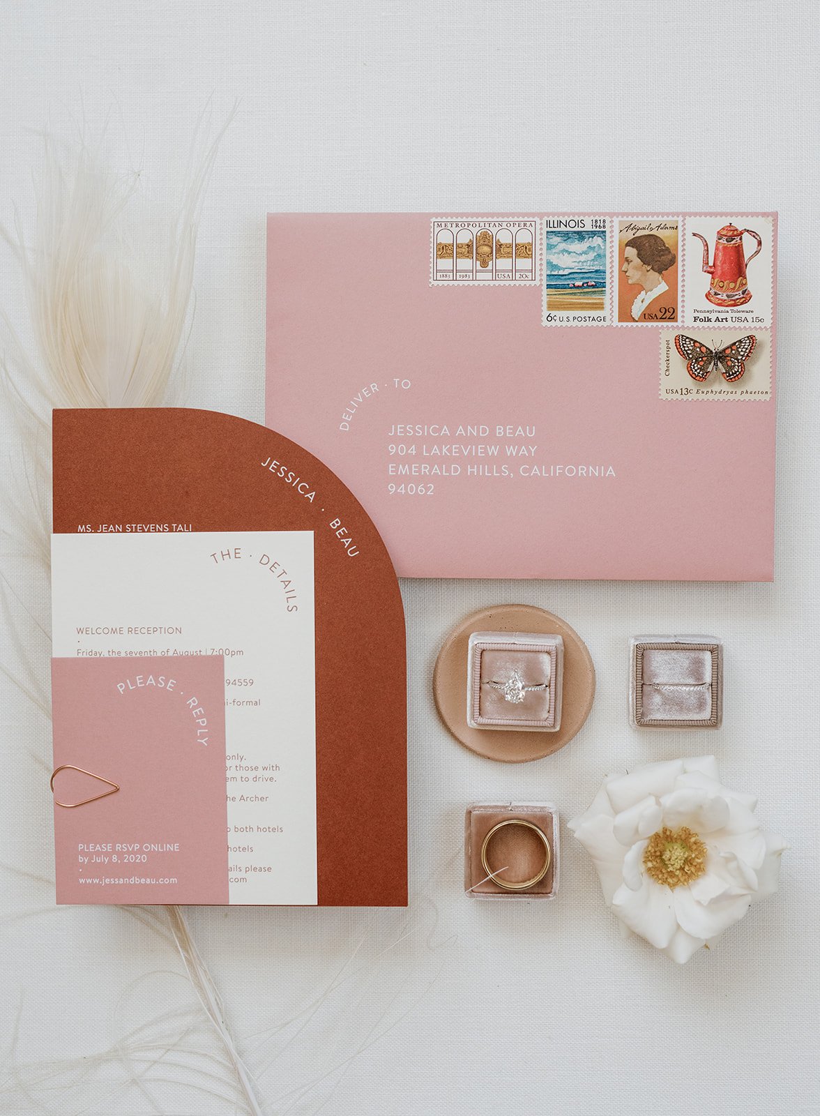
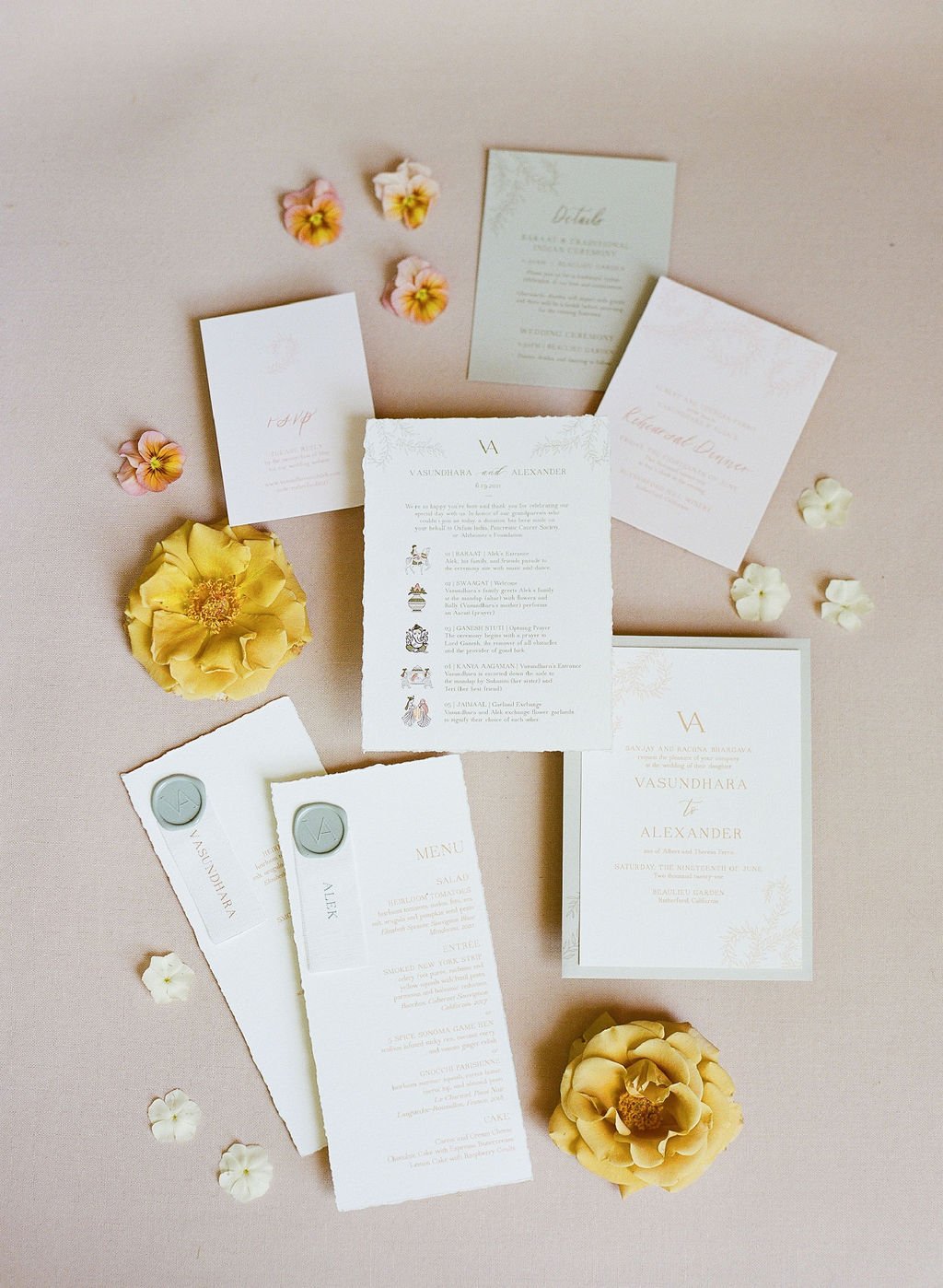
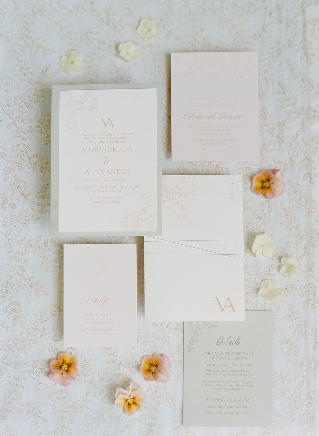
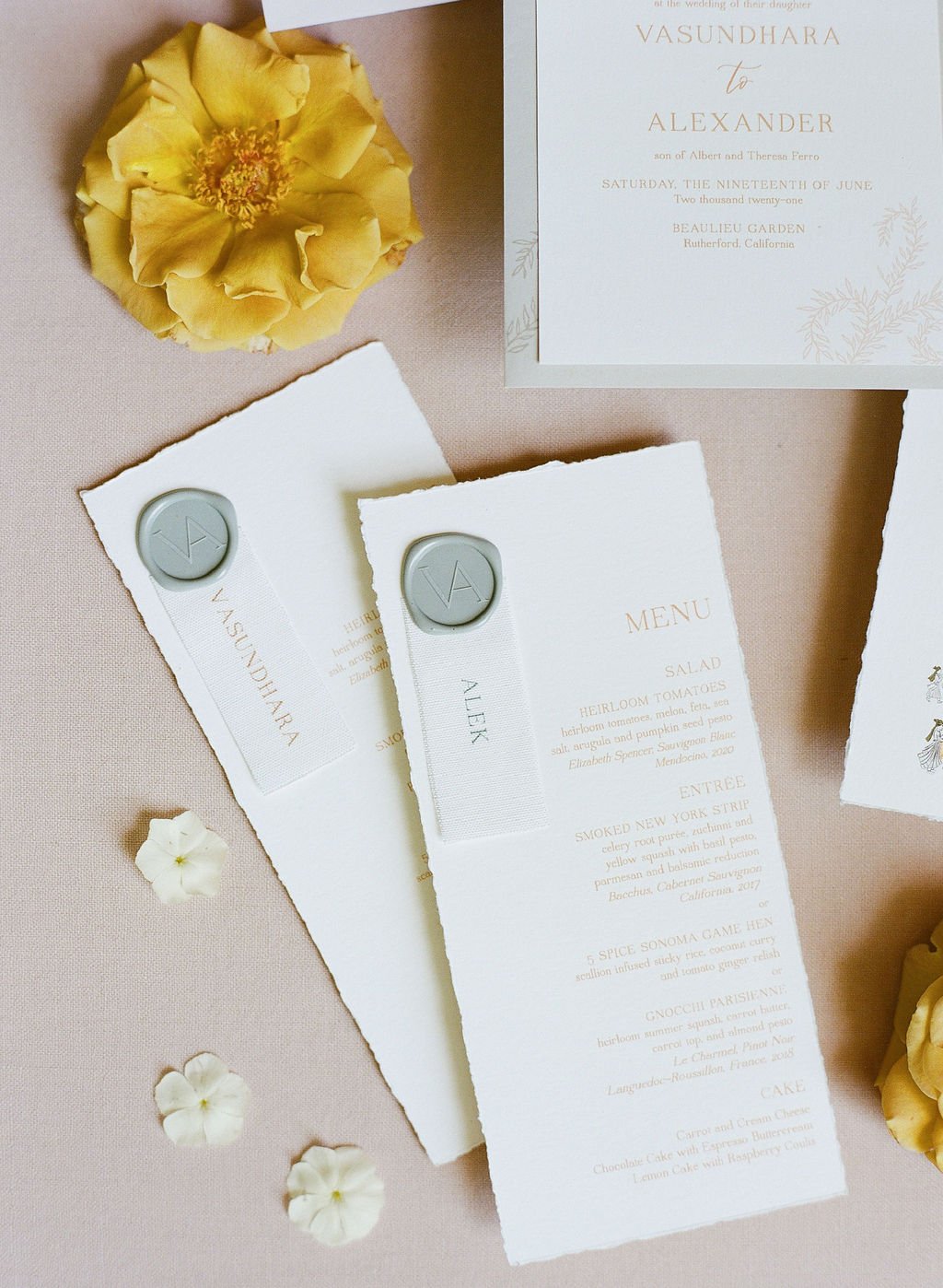
I owned and operated a business called the Bright Line Studio that focused on wedding branding, invitation suite design, wedding day-of signage and paper goods, small business branding, and calligraphy education and resources.
Very similarly to a normal graphic design projects, I worked primarily with wedding planners to develop a design direction for the paper goods and signage. Each wedding had it’s own look and feel and needed to be branded. In most cases I created a logo for the couple, a color pallete, sourced curated papers and materials, worked with a variety of vendors to print and develop large scale signage and paper goods. A wedding guest recieves its first impression of a wedding with a save the date and invitation so it is important to set the tone with a design that will follow them into the wedding.
With mostly all of the paper goods and signage being assembled by hand it was a true labor of love bringing these wedding designs to life.
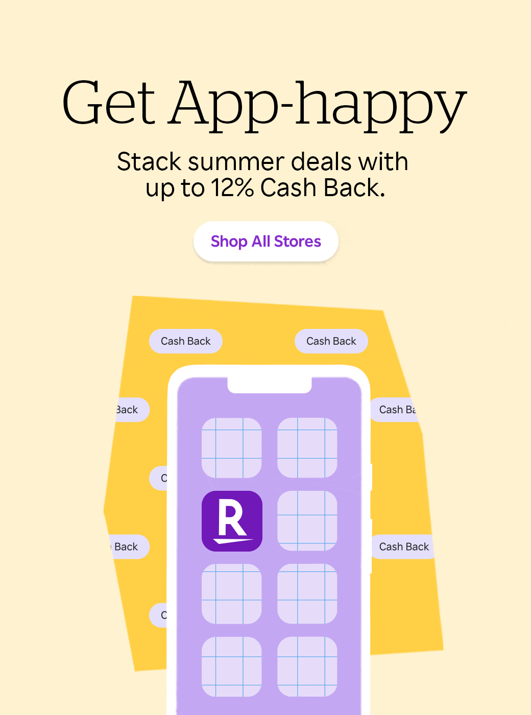
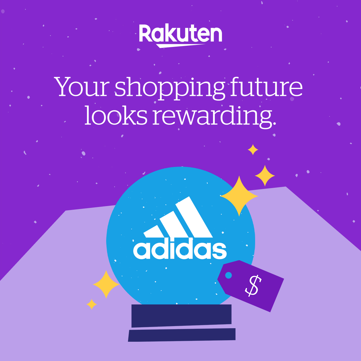
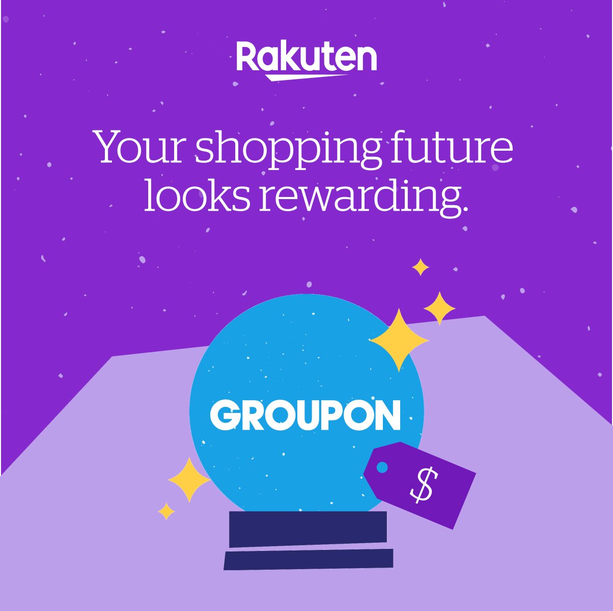
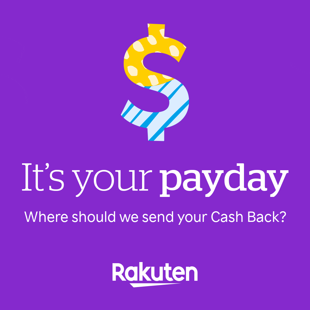
At Rakuten I was able to use their bold, playful, and illustrative brand system to create a variety of branded assets ranging from marketing ads, social ads and gifs, simple animations, and illustrations. You will see a selection of some of these various assets here. With all of these together you can start to imagine how flexible this brand system could be.
With a brand this flexible it was important to know how to successfully mix bold patterns, colors, and product images in a clear way to promote various offerings.
The illustrations were used in various shopping categories such as “glasses and contacts,” “medicine and drugs,” and “spa” in the Rakuten app as well as their website.
Lending Care is an internal LendingClub initiative focused on our customer service sector of the company. Being a financial services company we put a lot of importance on our customer service. A lot of the people on the customer service team had never done this type of work or might have been new in their careers. Lending Care was developed as a visual aid and tool to engage these employees in there learning and development.
Three icons were designed and paired with their three pillars of customer service: Build a relationship, Make it easy, and Think ahead. Posters, notebooks, t-shirts, presentation decks, and even large workplace graphics were developed for their office spaces, and multiple events within their team.
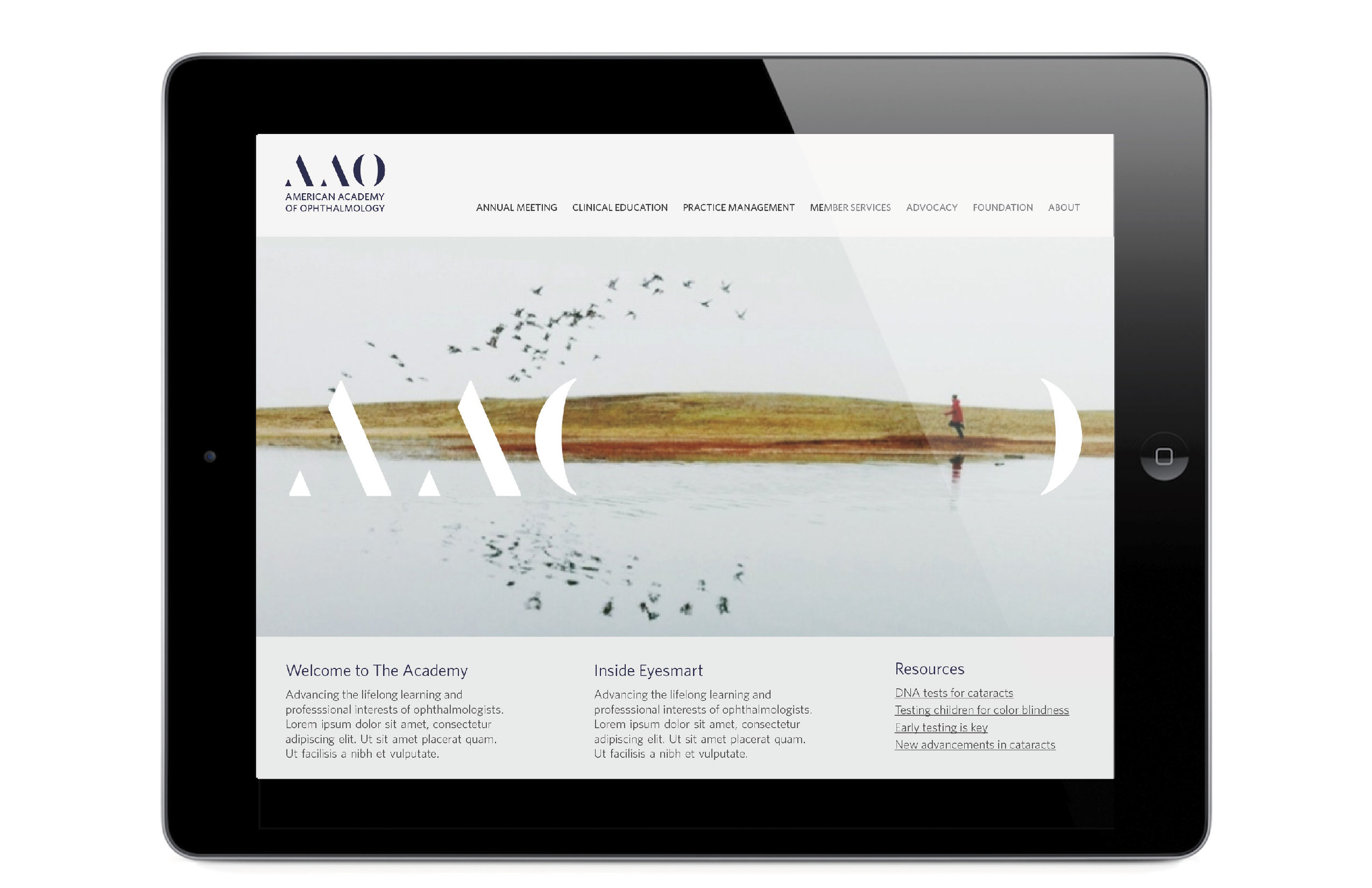
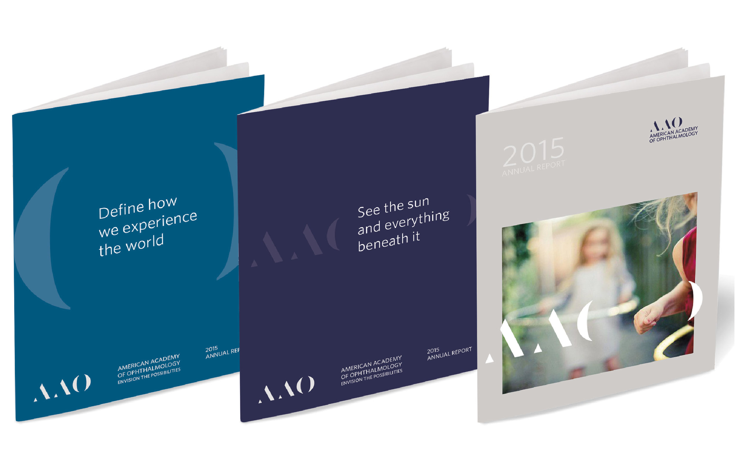
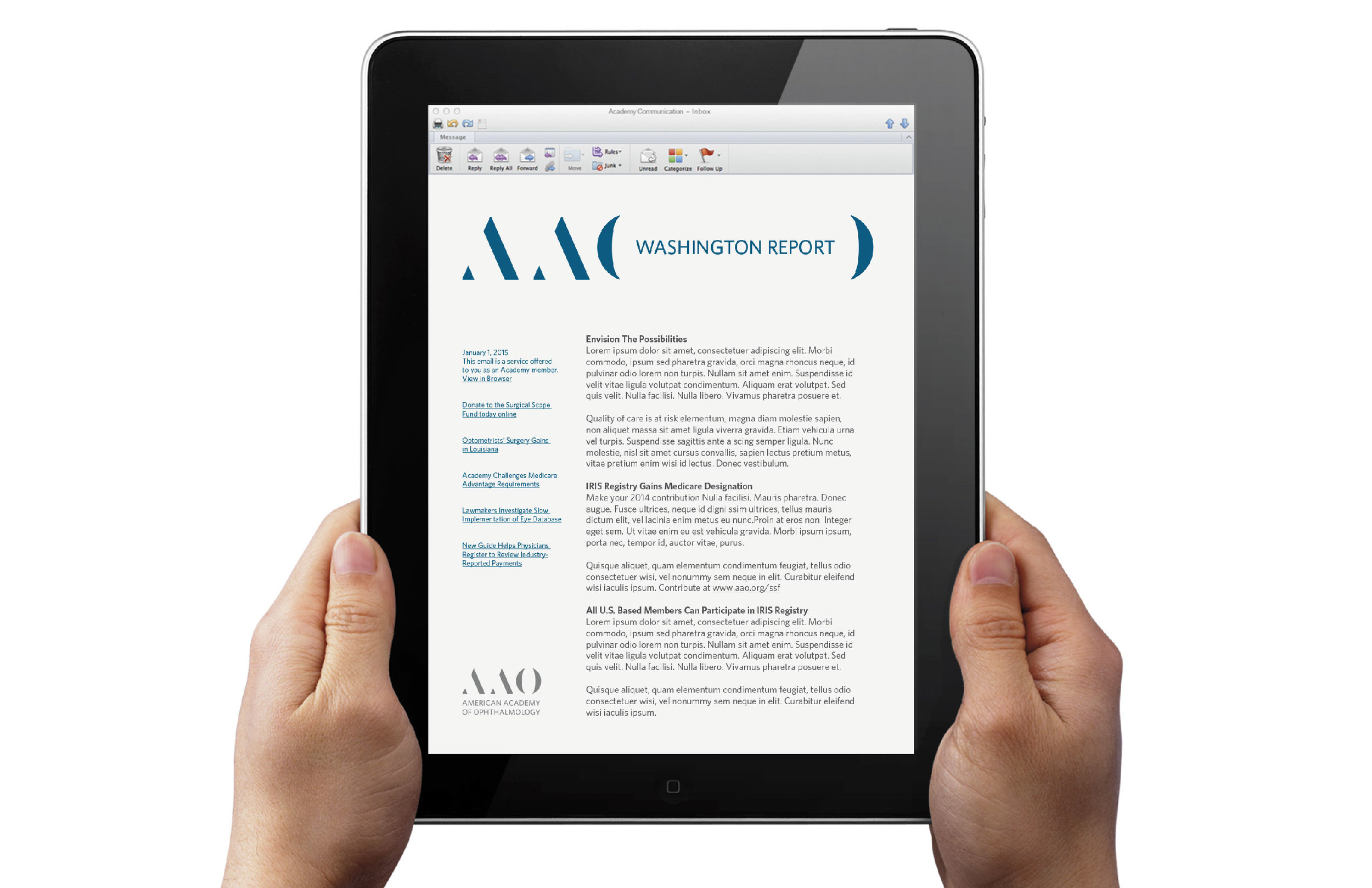
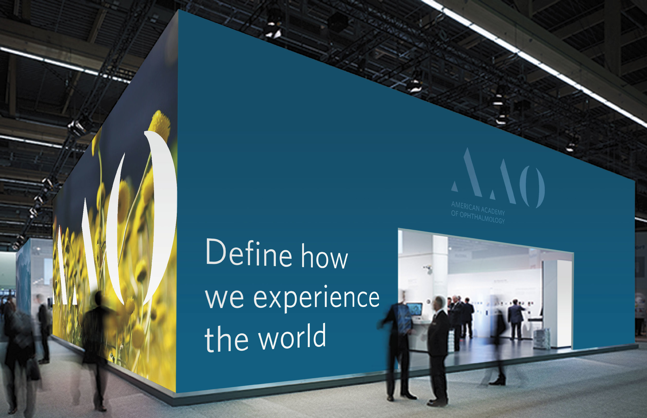
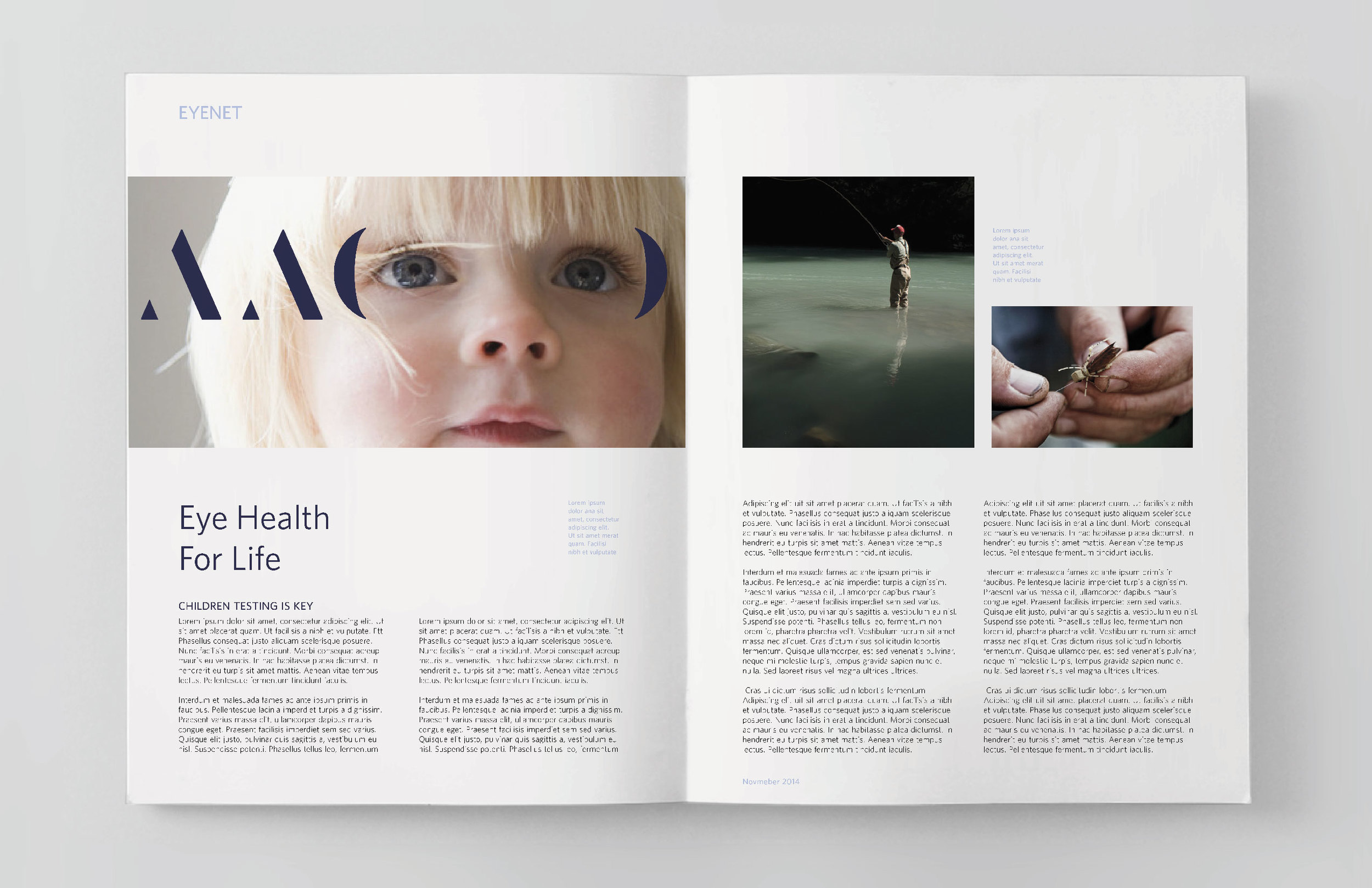
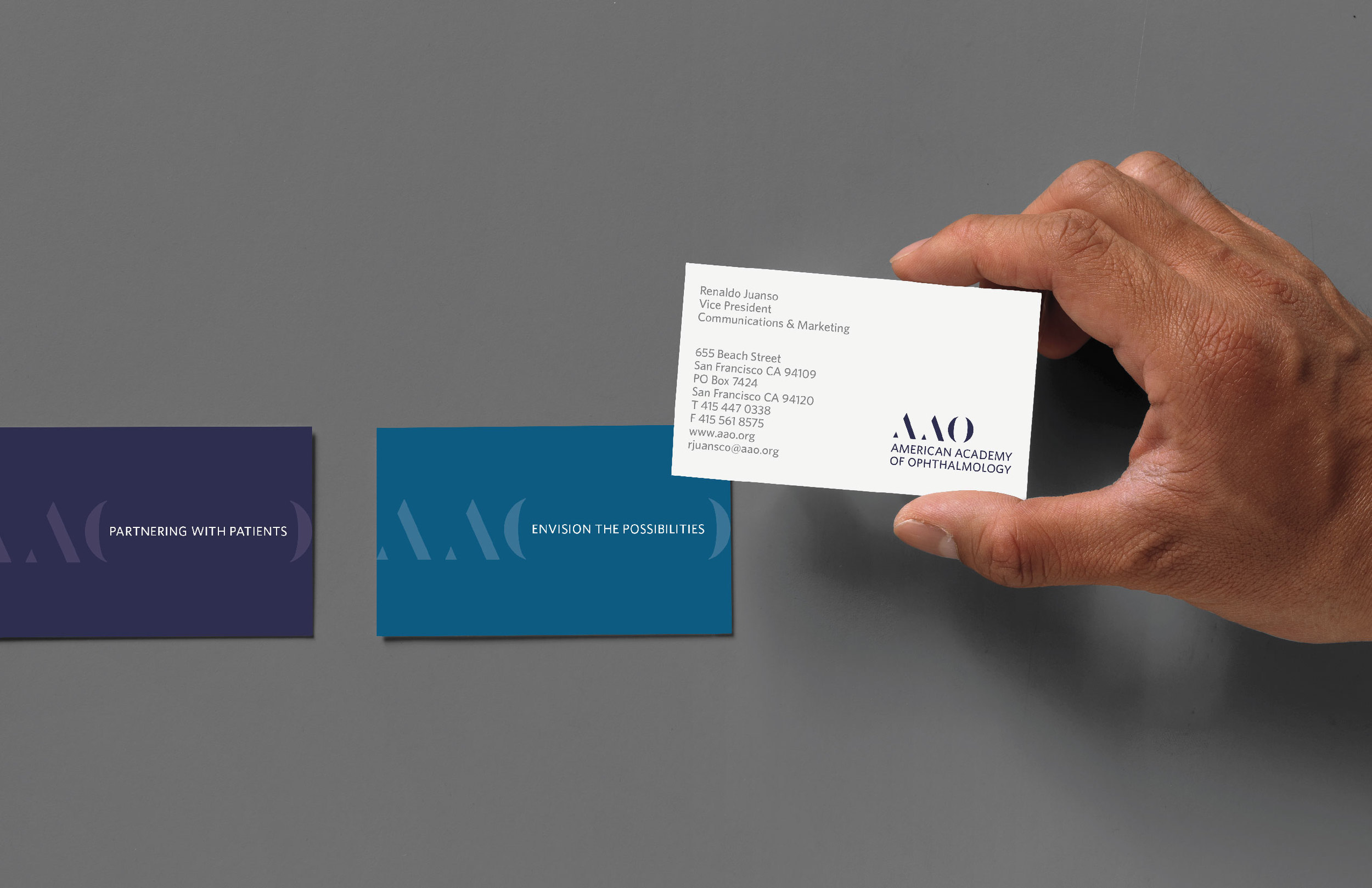
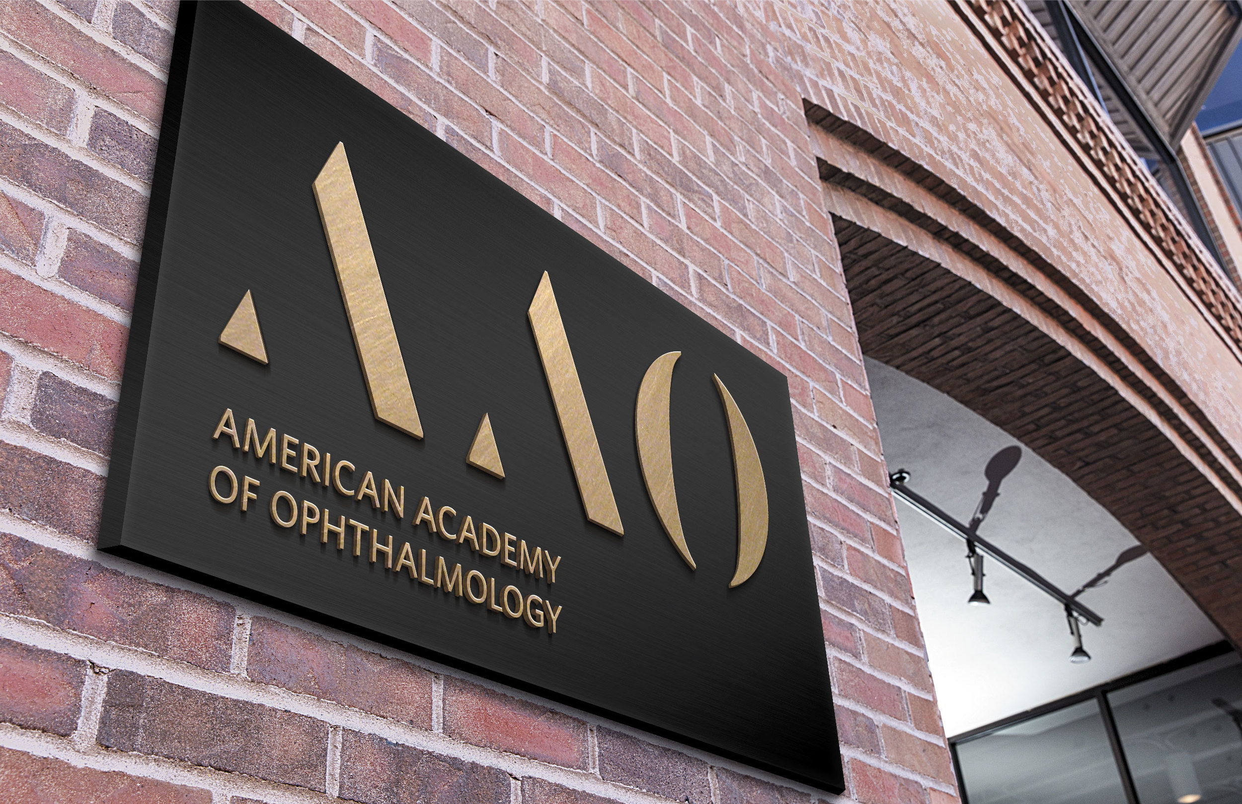
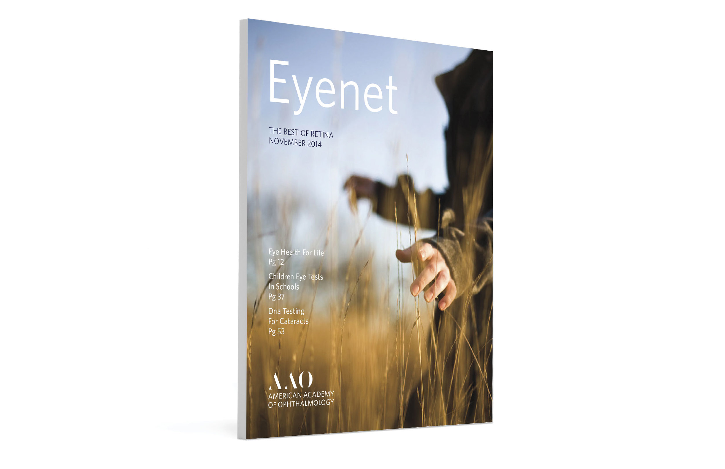
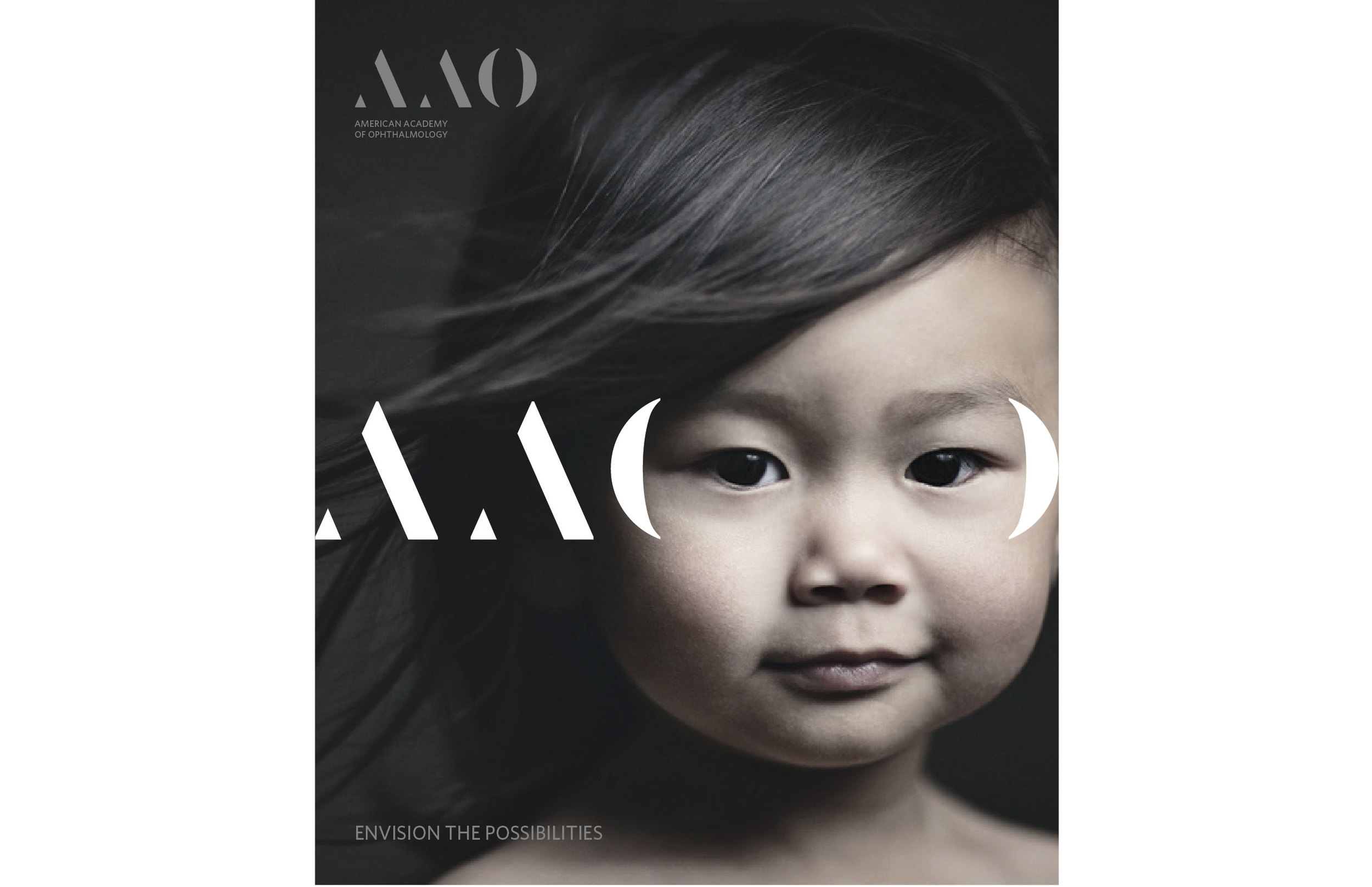
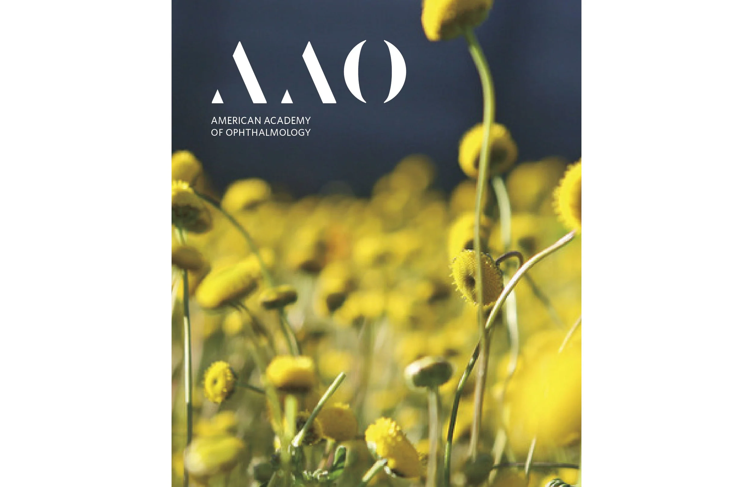
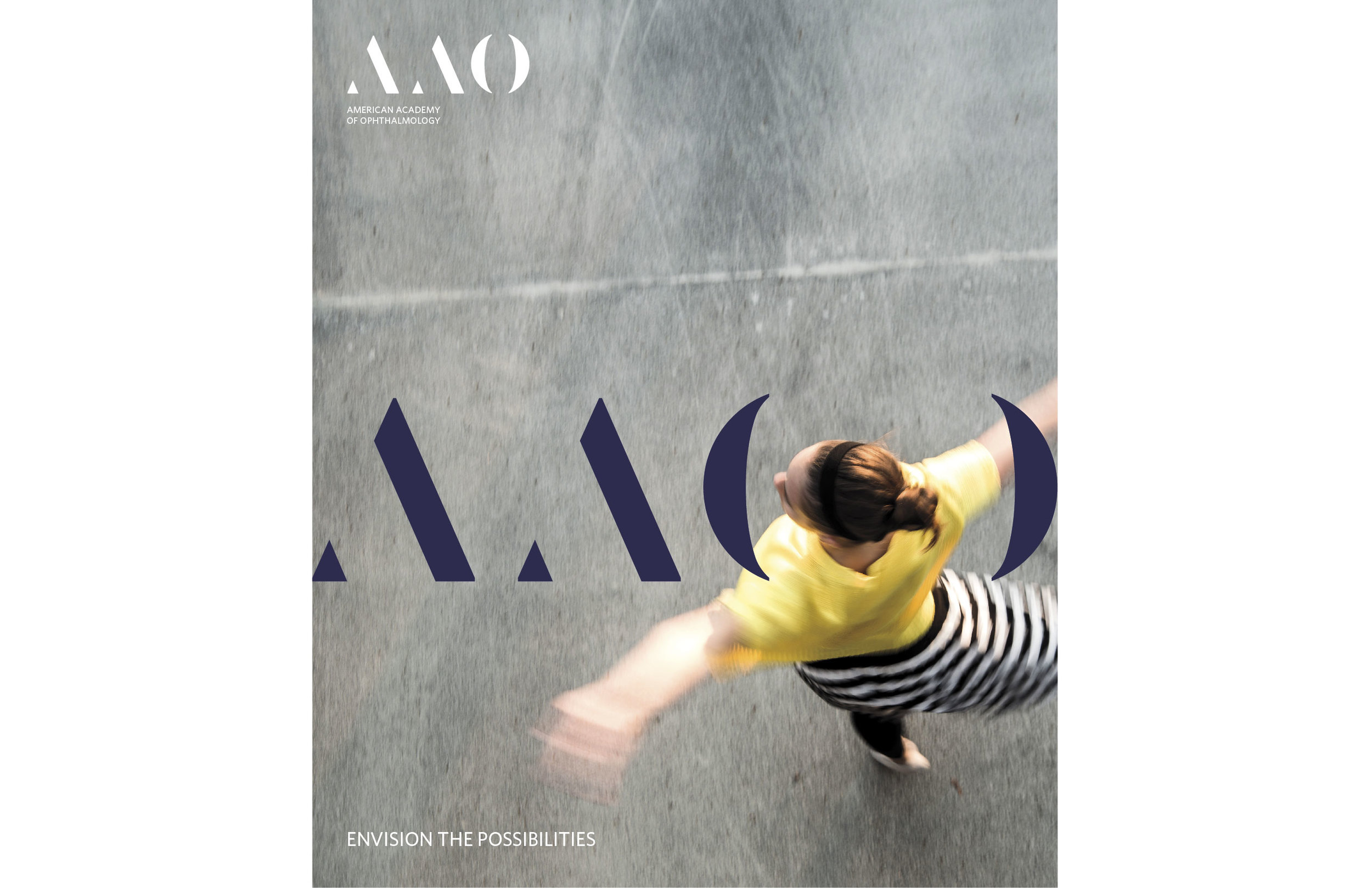
Proposed work for The American Academy of Ophthalmology, the largest national membership association of Eye M.D.s Ophthalmologists. This Academy is seen as a fraternity of doctors who focus their medical attention in the areas of education, innovation, and advocacy.
This logo and look and feel system reflect the prestigious Academy through its bold letter forms. The "O" within the logo acts as a portal that flexes to reveal a variety of things or focus on parts of imagery. The "O" can contain phrases or act as a simple framing device. The imagery within the full system is compiled of the beautiful things that we can see and appreciate with our eyes.
Completed at: Landor Associates